top of page


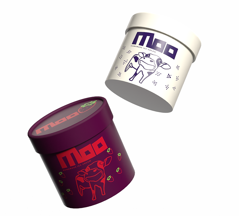
Moo is a return to the classics. We believe that the most loved ice cream flavors became classics for a reason — they’re familiar, comforting, and timeless. Instead of reinventing what already works, we focus on doing the essentials with care, intention, and quality.


HOMEMADE ICE CREAM
Font
Epilogue
AaBbCcDdEeFfGgHhIiJjKkLlMm
NnOoPpQqRrSsTtUuVvWwXxYyZz
The visual identity reflects this philosophy: bold, minimal typography and simple forms create a clean foundation, while thoughtful pops of color reference the richness and personality of each flavor. The result is a brand that feels fresh but rooted, playful without being loud, and sincere in its celebration of real, honest ice cream. Moo is where classic flavors are honored, refined, and enjoyed with a sense of everyday delight.
LOGO

FLAVOR ITERATIONS


MOCKUPS


bottom of page